Today, it’s never been easier for mobile apps to reach customers wherever and whenever they are—provided they have access to the right tools to do so.
The growth and evolution of push notifications, email, and SMS have opened doors for marketers to reach users outside the app to ensure they re-engage and keep coming back.
But what about when users are inside your app? How can you ensure your active app users have a seamless, positive experience every time they launch your app?
With in-app messaging, the focus is on enhancing a user’s current session in your app. The increasingly crowded app marketplace makes in-app messaging a critical part of your mobile engagement strategy—one that reaches users at the right time, in the right place, and is consistent across platforms.
Inside v Outside The App
Well-executed in-app messaging harnesses the power of contextual, personalized experiences where and when it matters most. Engaging users that are already giving their full attention to your app makes in-app the most powerful messaging channel on the market.
Take a look at the below data. There is no comparison between users engaging via channels such as email, SMS, and push versus in-app. Inside the app always performs better—even for generic, non-personalized messages.

Add personalization (harnessing user information to deliver highly targeted and relevant experiences to the right person at the right time), and we see the engagement rate of in-app increase dramatically.
For peak performance, contextual messaging results in up to 74% engagement rates. Contextual takes into account the user’s environment—what they’re doing and where they’re doing it right now. In other words, the context in which the user is ‘found’ as opposed to personal information about them.
Mobile messaging should be all about context: delivering information to users at highly relevant moments throughout a user’s journey. In that sense, mobile isn’t just a channel. It is a continuous stream of contextual and behavioral data.
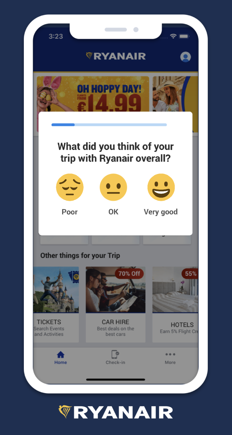
The below is a perfect example of delivering a contextual experience. Ryanair served a satisfaction survey to passengers the moment they landed and turned off flight mode. The message resulted in an 80% survey completion rate.
The most important thing is to approach both personalization and contextualization with the customer response in mind so that the brand is deploying targeted messaging that feels relevant without being intrusive.
What are In-App Messages?
In-app messages are targeted notifications that mobile and desktop apps can send to users while they are active in the app. They facilitate real-time engagement and are an essential tool for enhancing the user experience.
Brands use in-app messaging to engage users at the right time, facilitate onboarding, share product updates, offer support, promote relevant offers, and make personalized recommendations.
In-app messages are integrated into the entire app experience, so users don’t have to opt in to receive them. Because they’re hard to ignore, in-app messages can be the most valuable addition to your user engagement strategy.
Types of In-App Messaging
There are three inside the app mediums marketers can implement as part of their in-app messaging strategy.
Overlay In-App Messages
There are several overlay formats you can create for your campaigns. A full-page display provides you with a full-screen takeover to convey your message. Deep-linking is a powerful feature here that allows you to direct a user to a specific conversion event such as a paid subscription or product add-on.
Half-interstitial messages appear as a pop-up taking up the center of the screen. This format is typically used to display a service message, guide users through the app as part of onboarding, and present timely promo offers.
Overlays can also be designed as small, pop-up screens that are most effective for drawing attention to specific app features, providing walkthroughs, and offering helpful tooltips.
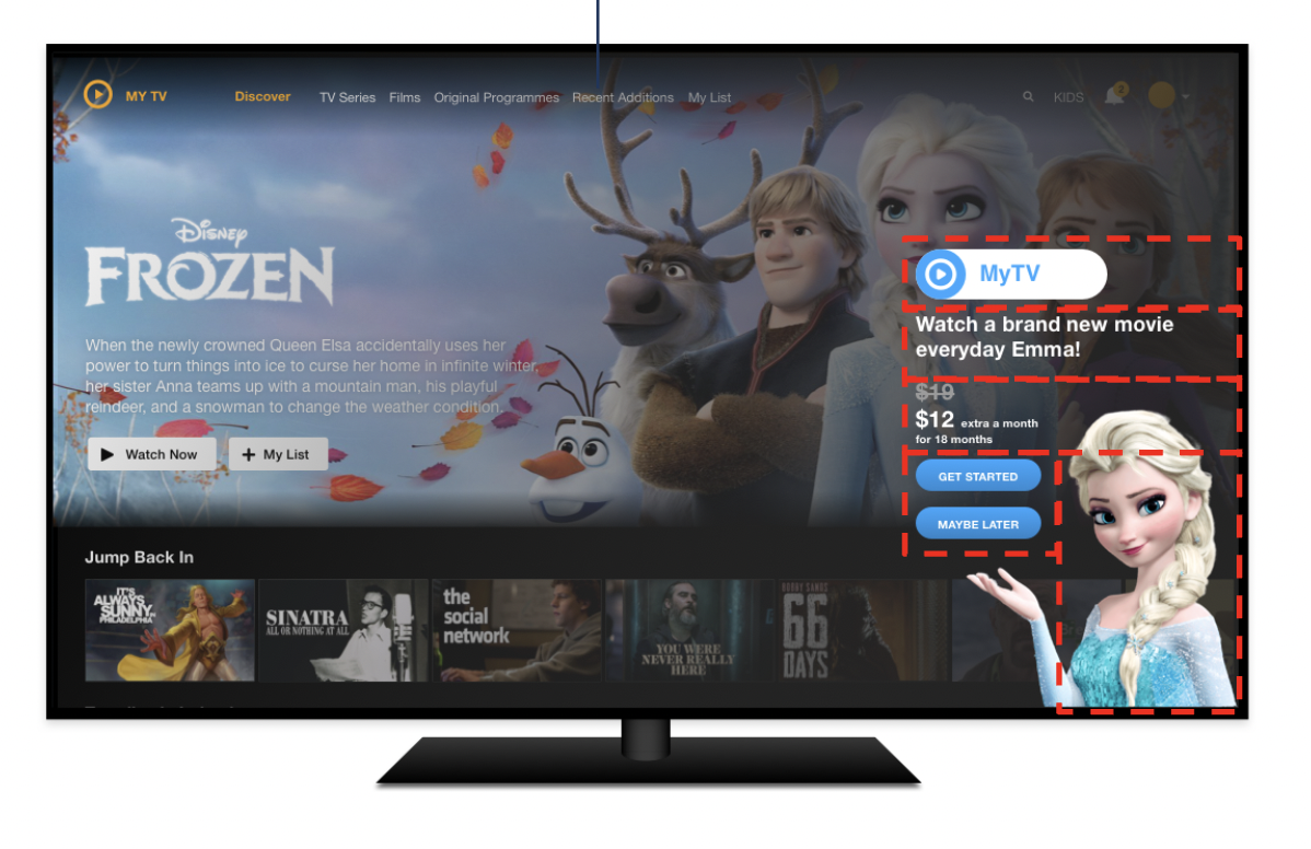
The versatility of your in-app design canvas is key. Some consumers have a pavlovian response to seeing a square dialog pop-up, so their first inclination is to locate the X or dismiss button. With a versatile canvas, you can avoid this reaction. See the below two examples of a versatile canvas in action.

Embedded In-App Message
An embedded in-app message sits seamlessly in the app’s core UI and presents as part of the native app experience. The beauty of embedded is that it doesn’t disrupt the user flow or require users to take action at that moment to continue what they are doing in the app. They are, in a sense, sticky messages.
Embedded experiences don’t look or feel like marketing. They are pixel perfect with the app and brand UI while still offering all of the dynamic personalization capabilities of in-app overlays. And with no HTML required and instant rendering capabilities, the campaign loads instantly in the app.

Source: Think With Google
Embedded App Feature
Embedded experiences are not just limited to content and messaging. App teams can use embedded to add or test new features or UI without the need for additional development time or app store submissions.
For example, game studios can increase or decrease gameplay speed to make the experience easier or difficult depending on the user. This capability is truly revolutionary for app marketers and developers and unique to Swrve’s platform.
Best Practices for In-App Messaging
It’s easy to introduce messaging campaigns to your app strategy and start reaching out to customers in random isolated blasts. But this approach is unlikely to work.
Apps need to incorporate messaging throughout the user journey and deliver value at the highest impact moments. While this takes time to get right, it is much more worthwhile than a hit-and-hope approach.
Follow these tips to create thoughtful in-app messaging that moves the needle at every step.
Use Consistent Messaging and Branding
In-app messages present to users as part of the overall app experience and, in that sense, are an extension of your brand. Hence, your messaging, branding, and overall look and feel should align with the brand to deliver a consistent experience.
Your message design should be engaging without being distracting and reflect your app’s color scheme, fonts, and style. As an industry best practice, most in-app messages should be limited to two or three colors from the brand or app’s color palette.
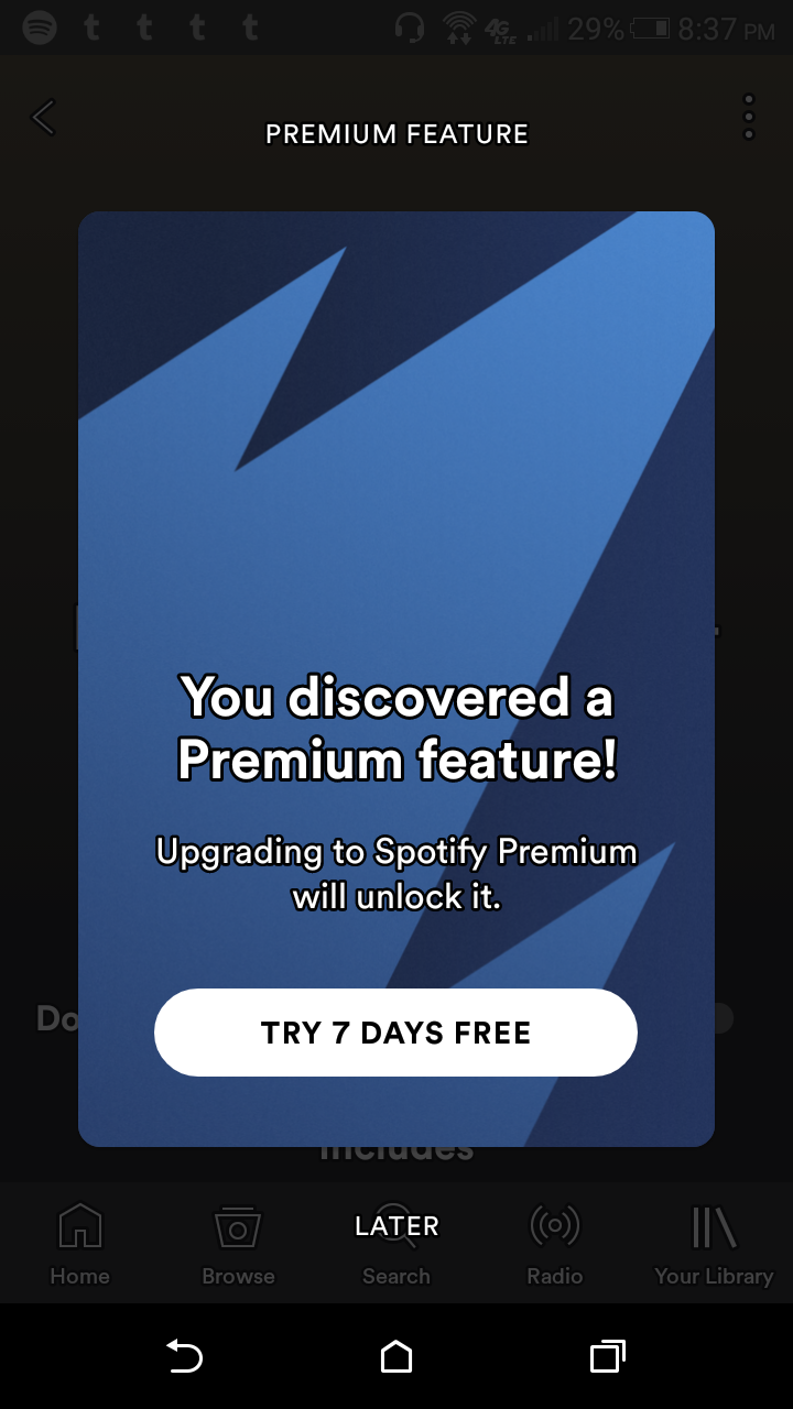
Here’s a great example from Spotify of a simplistically designed message:
Personalize Your Messages
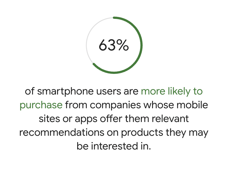
Like any other messaging channel (email, push notifications, SMS), in-app messages should be relevant and meaningful. Otherwise, your users will learn to dismiss them as spam.
There is ample research to show that personalized messaging performs much better than generic blasts. While personalization today goes well beyond using a customer’s name, simply adding this user attribute to your messaging can increase click-through rates by more than ten percent. This alone shows the power of 1:1 communication.
Of course, personalization now goes much deeper than this, and it's what users expect. Each message you send should accurately reflect where that user is in the journey with your brand and where they are likely headed next.
For instance, when a customer launches your app for the first time, they should be presented with an onboarding walkthrough. Personalization is users not receiving this same experience once they have explored the app’s essential features and completed the onboarding process.
Personalization is informing a user about an important traffic update at the regular time of their daily commute based on the route they usually take. Personalization is sending film recommendations to a user based on their preferences, previous viewing behavior, and time they typically browse film titles. Personalization is knowing each individual customer and showing you care through relevant, contextual messaging.
Source: Think With Google
To successfully deliver personalized messages to your users, you need to segment your audience, which brings us to our next tip.
Segment Your Audience
As we already emphasized, for customers to pay attention to the content put in front of them, it needs to matter to them personally and be relevant in that moment. To maximize your engagement rates, send messages to specific customer segments rather than blasting generic messages to every user.
The more granular you get with your targeting, the more room you’ll have for personalization. Put simply—group your customers into segments, and send each group the messages most relevant to them.
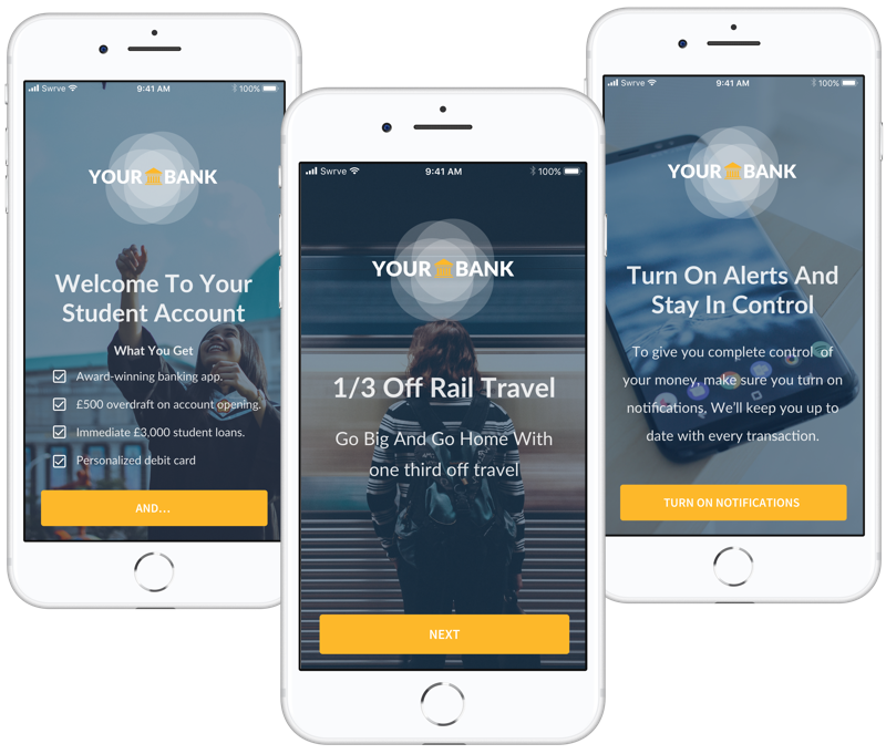
The below app sends this in-app message sequence to its new user segment:
Find the Right Mobile Moments
Our mobile devices are the most personal pieces of technology we own. And because they are with us every waking hour, brands have huge opportunities for deep personalization. Ensuring your in-app messaging is perceived as helpful rather than disruptive is largely down to pinpointing the right mobile moments to engage with users.
Communicating important information to users at the wrong time is almost as bad as never reaching out to them at all. Make sure your messages appear at a time that flows well with the user’s experience.
For example, it makes sense to introduce a new feature you want users to explore while they are completing a task whereby the feature would help in that particular scenario. In contrast, presenting the same information on app open or during an unrelated task while the user is mid-flow could be perceived as disruptive rather than helpful.
You can send messages in the middle of a user’s experience, but only if it makes sense, such as to offer assistance. You could display a subtle tooltip when users explore your latest feature to give them guidance on how to best use it, for example. That kind of in-app message helps alleviate potential frustration with your product.
If the message is proactive, it should occur after customers take a high-value action within your app (like completing a purchase or a game level) rather than in the middle of an action. If you’re asking customers to leave feedback through a survey, it should occur at a non-disruptive moment rather than interrupting the action the customer came to take.
By testing the timing of your messaging, you will learn at what stages messages are more likely to engage, delight, and even retain users.
Focus on Your CTA
Your message content is important, but a lot of the time, you’ll want your users to take a specific action. Your job as marketer is to find the best CTA based on the action you want users to take. Your click-through rate is one indicator of your CTA’s success in achieving your desired goal. Use your CTA to prompt users about what their next step should be. Clear CTAs tell users what action they should take next.
Personalized content combined with one-tap CTAs, decreases the time it takes to perform a particular ‘job’ and lowers the cognitive load. Reducing cognitive load—the thinking involved in completing a task—improves user experience and increases conversions.
Alluding to the importance of avoiding disrupting your users, always provide an easy exit from your in-app message by clearly displaying an ‘X’ or close icon. If users want to but can’t find an exit route, they could quickly resort to closing the app instead.
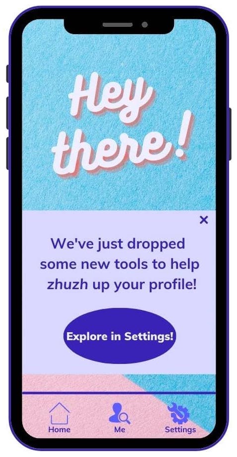
In the following example, the CTA tells users they can learn more about the latest features in the Settings tab. Anyone preferring to wait and explore those features later will know precisely where to find them.
Use Rich Content and Media
Just like with push notifications, the use of rich media can significantly boost the performance of your campaigns. Simply adding an emoji to your in-app message can result in a 40% higher engagement rate. Including an image can produce up to 650% higher engagement rates than text-only equivalents. Visual content draws users in and entices them to read your message copy.
In-app messaging aims to win users’ attention without appearing annoying. The best way to do that is to keep things simple. When creating your message, write concise copy and get to your main point quickly, particularly if you are including an accompanying image. You don’t want the message to appear crowded.
Boil your message down to only telling users what they absolutely need to know to engage with your product at that moment. The less text users have to consume, the more they can focus on the purpose of your message.
Use a Multichannel Approach
In-app messaging is one of the most powerful tools for engaging your active app users. But you shouldn’t rely on just one communication channel for your engagement strategy. Reaching users via in-app messaging is limited to when a user is currently active in your app. Hence, there is still a need to use other channels to reach your users when they are outside of the app.
Instead, you should combine in-app messages with push notifications, embedded experiences, and email to create a cohesive multichannel strategy that can reach users where they are.
To stay on top of current industry trends, learn how push notifications have changed and grown over the past decade.
A/B Testing is Crucial
Successful in-app messaging campaigns result from detailed research, successful segmentation of users, and well-executed A/B testing.
Before launching an in-app message campaign, it is best practice to implement A/B testing to optimize elements such as text, CTA, placement, and imagery. A/B testing significantly improves your chances of success by identifying which version of your message resonates best with your audience. For example, you could test a number of images and analyze how each affects your click-through rate.
First, to test your message, produce two or more versions of your campaign with one variable changed. The more subtle the change, the more accurate your results will be. Then, send different versions to small groups of customers. For instance, if you were testing a message placement, you would send each version to a different group to identify which performs best.
Testing your messaging before communicating with every user in your app lets you learn what makes a successful message and helps you avoid sending unwanted messages to your users. By continuously A/B testing, you can learn what works for your audience over time.
As a rule of thumb, you should always test in-app messages to see which ones are delivered with the most success. In Swrve’s platform, it’s easy to iterate messages based on performance.
Download our guide on How to Manage Effective A/B Testing to learn more.
Start Delivering Personalized In-App Messages
When customers engage with a brand, they expect the same first-class experience across every platform and channel. Your in-app messages are no exception. Well-timed and well-crafted messages can transform engagement and the entire user experience.
Start by identifying the high-impact areas for improvement and continue to test and experiment as you go. Take note of engagement indicators like activation, milestones, inactivity, and churn. Then use in-app messages to help users navigate towards whatever success looks like in your app and encourage specific actions to keep them engaged.
With Swrve, you can customize your campaigns to stay consistent with your branding, send timely messages based on real-time user behavior, and increase engagement by creating mobile experiences that delight users. And all from one easy-to-use platform.
If you want to take a closer look at our powerful messaging platform, book a 1:1 product demo with one of our marketing experts.
For more insights into how to develop your mobile marketing strategy, check out some of these resources:


